House Style & Headlines
Times:
Their way of showing their writing is most definitely in a professional way, all laid out in a column style to help the flow of text be easier to read. It’s common for the Times to use Sans Serif, a modern-looking font style, for their articles and titles. However, the titles have a boldness added to them making them stand out against the rest, the different font size being another factor. When it comes to their quotations they’re also enhanced by a boldness, but their font size is only slightly bigger than the regular text. An interesting factor is, Times seems to slip in and out of the habit of using Sans Serifs and Serifs styled fonts depending on the topic and the time the topic was set in.
While there the font changes every so often, the consistency of the wording and design is easy to understand. The information is set out in the way that the most important information is first. Further, the article goes on the more lose the information gets but keeping a good connection to the topic. However, the spelling and choice of wording are chosen carefully to match the view the publication wants for their magazine. Also, avoiding shortening down words or slang words to help keep that professional and serious look the Times has.
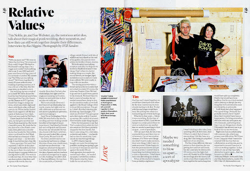
Times’ main colour, red, can be seen being used on quotes and sub-headings a lot through the pages, even if it’s a small amount. In a way, it’s a way to remind readers that they’re reading a Times magazine. For example one of the Times articles, the red in the photos are the most striking points of the entire double-page spread, almost like they’ve been enhanced to match Times’ colour. While the rest stays very basic and simple with the colours black and white being used, helping to keep the focus on the photos.
The Guardian:
Being one of the most read newspapers in the UK, it is obvious the Guardian has to keep up a sophisticated look. How they do this is through the colour choices, wording, typography, and many other things that make their articles and newspapers stand out.
Firstly, their typography, very much like the Times they use a Serif font for the name of the newspaper. However, one very big difference between the Times and the Guardian is that the Guardian only uses Serif styled fonts throughout their articles. This could be due to the Guardian being founded way back in 1821 (Britannica, n.d.), thus implying the Guardian is staying traditional to its old roots.
Swaying away from their traditional roots, their online version of their newspaper text layout is in paragraphs. This may be for the sake of convenience for only online readers, but they keep to the traditional column method in their printed versions. The online versions are isolated for each story to have a webpage dedicated to it. While the column method helps fit more stories in the printed version, this is so the same number of stories can be the same as the online version.
The colour The Guardians uses is their iconic blue both with their online and printed versions. Even though blue is used in many other newspapers, such as Wakefield Express, most people would think of the Guardian when the topic of newspapers’ colours is brought up. However, their online version, surprisingly, has pops of yellows and reds dotted around its web pages. The red is used to make words like 'exclusive' eye-catching to the reader, while the yellow is more of a promotional colour.

VICE:
While VICE is very similar to the Times and the Guardian when it comes to reporting on stories, VICE’s house style is very different from the two. This extends from the writing style and the layout of their articles, with the column method being absent. They lean toward fuller paragraphs with slight but simplified, details of a story while keeping the necessary information. However, this varies a lot on the seriousness of a story, for example, a political story would most likely be heavily detailed. While an article covering a TV series would be simplified depending on the target audience of the series.
Another reason, for the use of the paragraphs, they're commonly seen more than the column layout in everyday writing. Vice's target audience is a lot younger than the target audience for the Guardian and the Times. So Vice is going to use what appeals the most to their target audience, in this case, millennials.
The colours of VICE are very simple, this being black and white. While these two colours are very typical to see in magazines and newspapers, it always presents the publisher in a professional way. However, due to these colours being very simple it is easier on the readers' eyes than having several different colours. While VICE talks about several different things in their magazine, this either being political news or entertainment, it makes sense to have set colours that go with the topic.
